Truist Bank

BRANDING · DESIGN SYSTEMS · LOGO · SOCIAL · PRINT · VISUAL DIRECTION

Art Direction / Brand Identity / Visual Direction

THE CHALLANGE:

Rive Woodcraft came to me looking to reposition their brand. They had an established client base, but wanted to attract a newer audience of people who valued craft and quality over speed and convenience, and who saw a piece of furniture as an experience, not just a purchase.
The brand needed a system built to grow with them. One with enough range to flex across social, print, and product, while staying recognizably theirs. I began by building a moodboard to pin down the emotional tone they were chasing, and then used photography to help capture the feeling and the lifestyle the brand wants to position itself in.

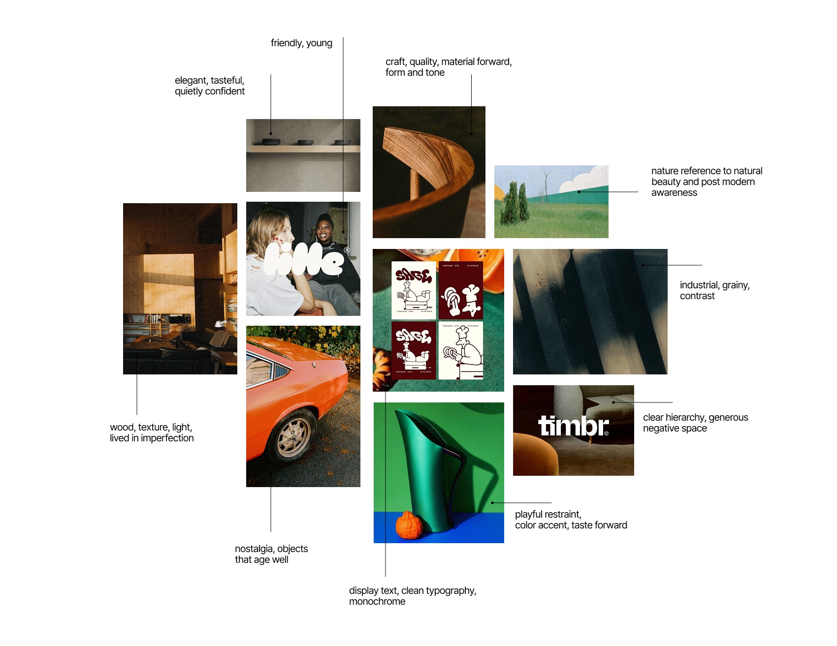
The brand needed a system built to grow with them. One with enough range to flex across social, print, and product, while staying recognizably theirs. I began by building a moodboard to pin down the emotional tone they were chasing, and then used photography to help capture the feeling and the lifestyle the brand wants to position itself in.

THE SOLUTION:

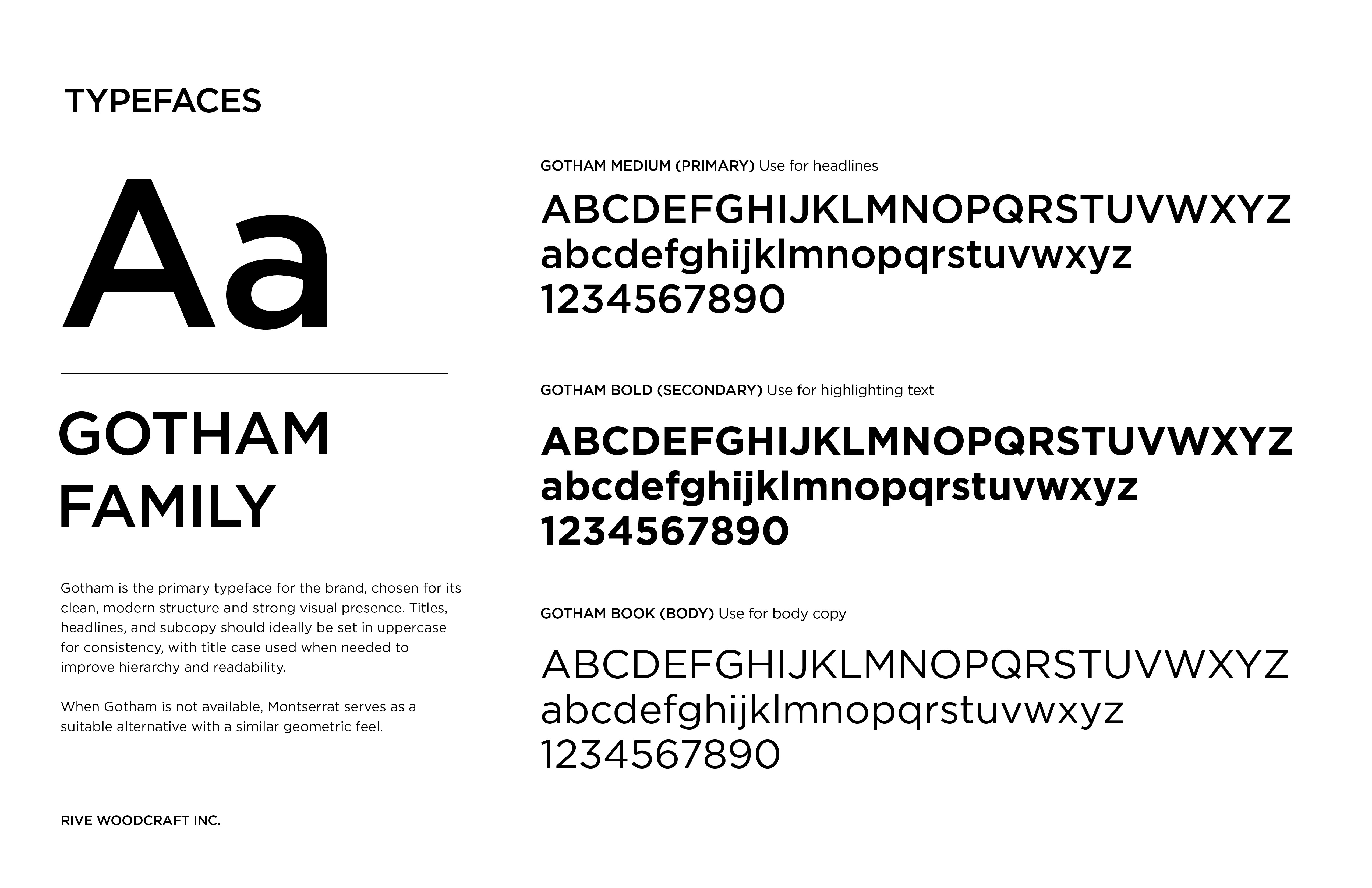
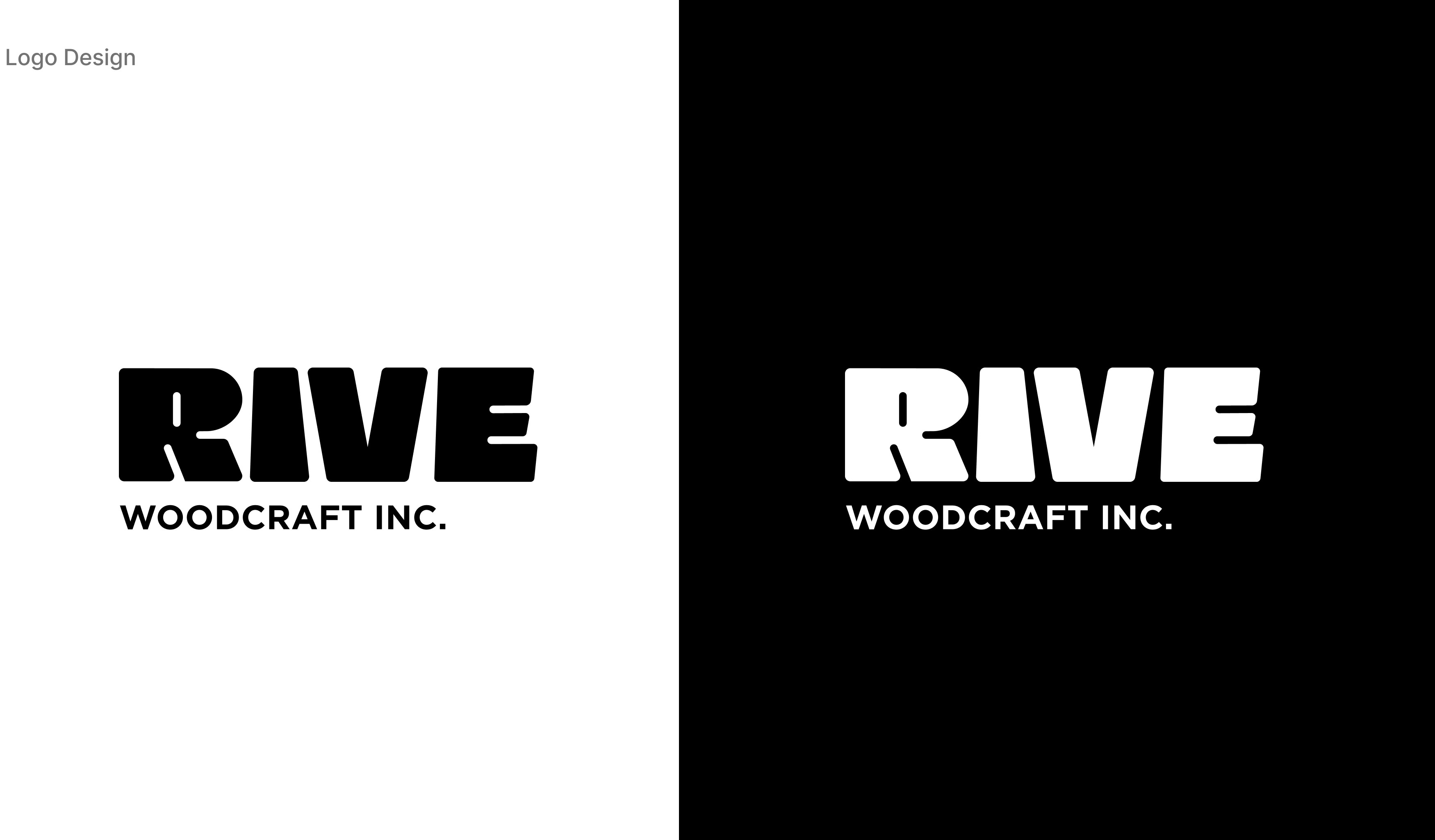
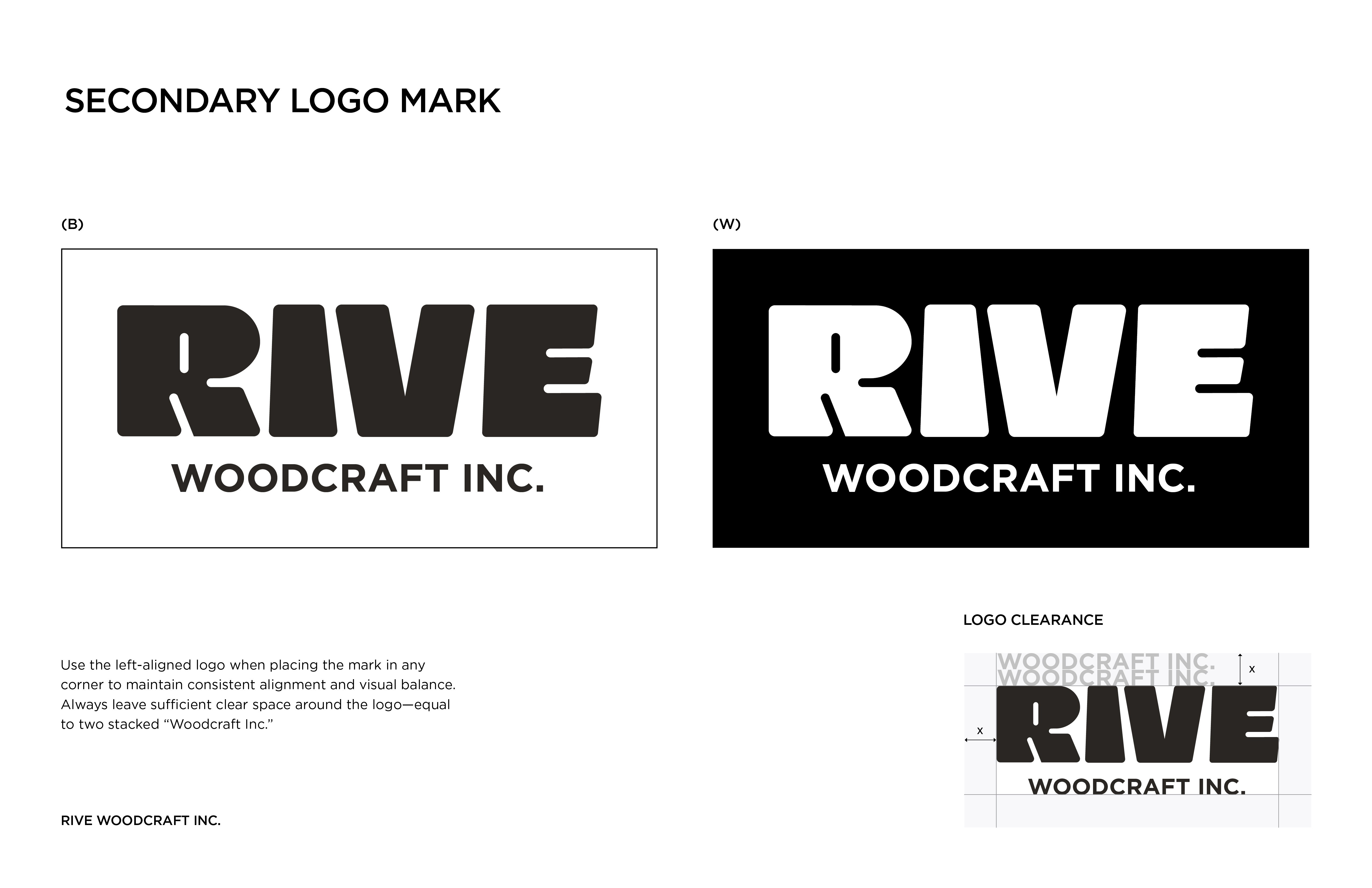
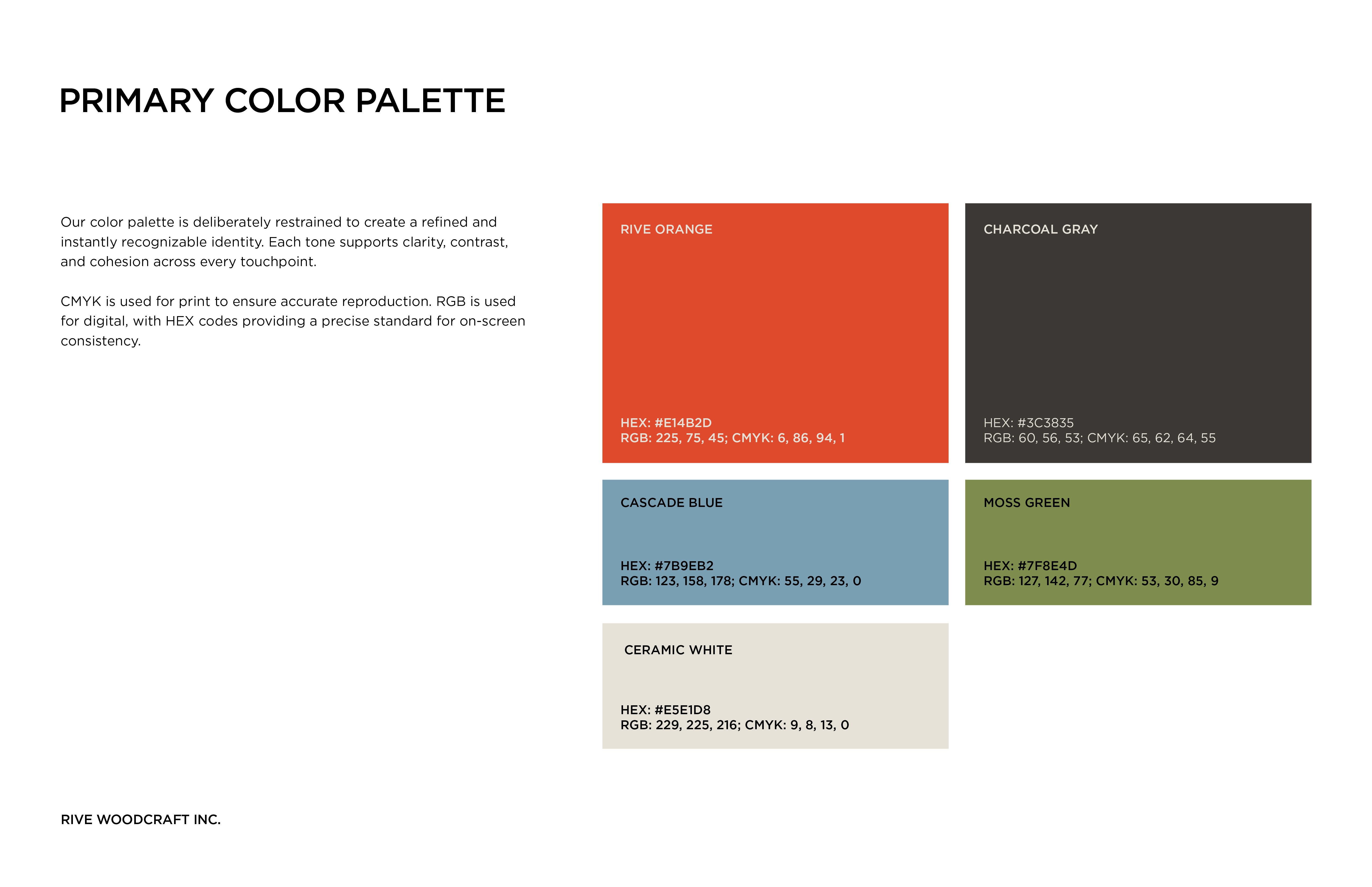
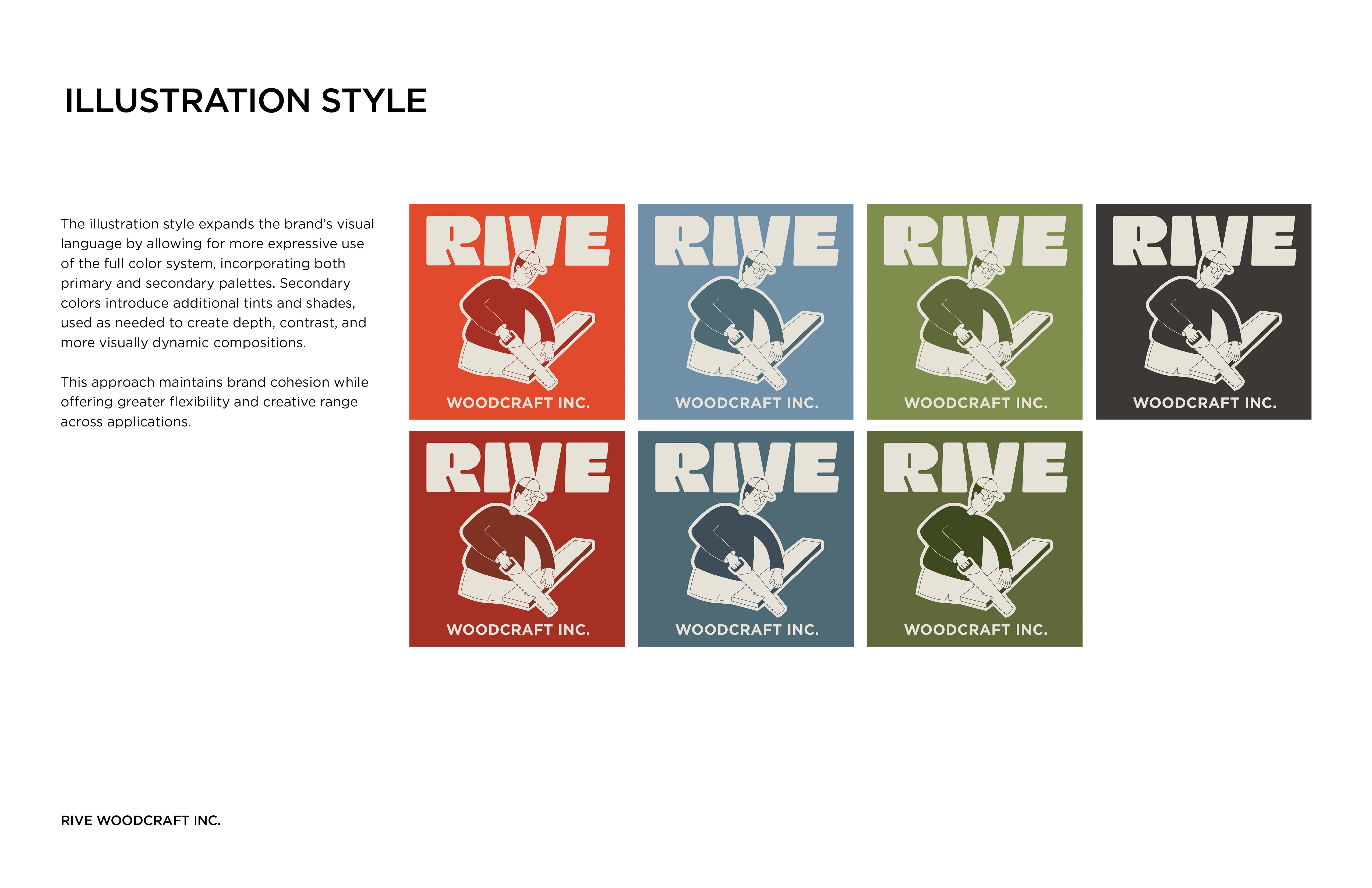
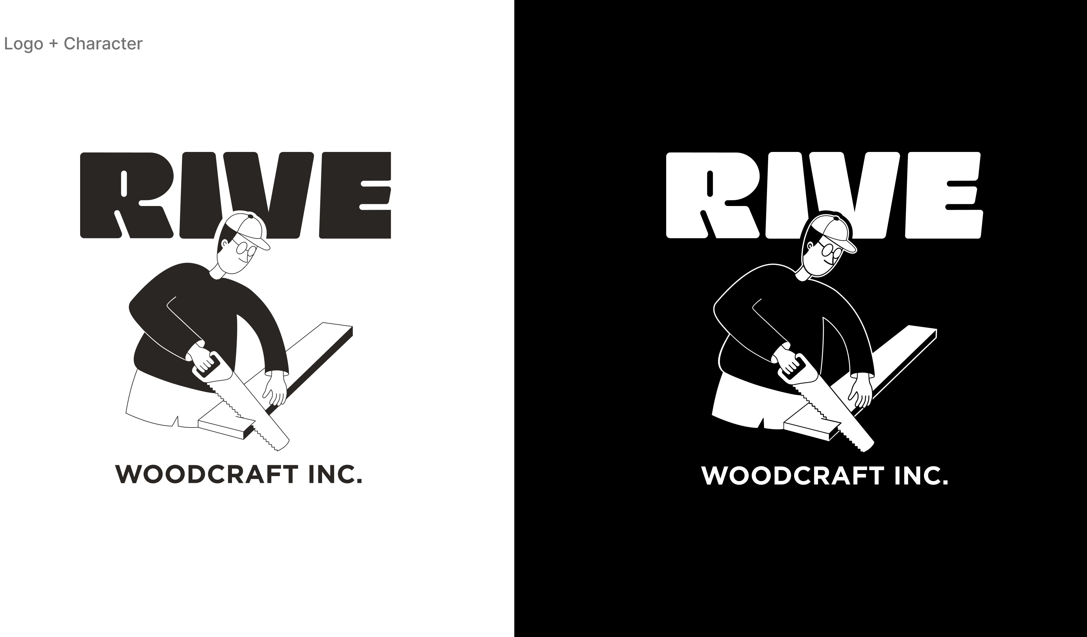
To achieve that without losing what made the brand credible in the first place, I led the brand strategy and visual direction end-to-end. That included a custom letter-mark logo, color palette, typography, and an illustrated character that gave the brand personality with a point of view without sacrificing sophistication.
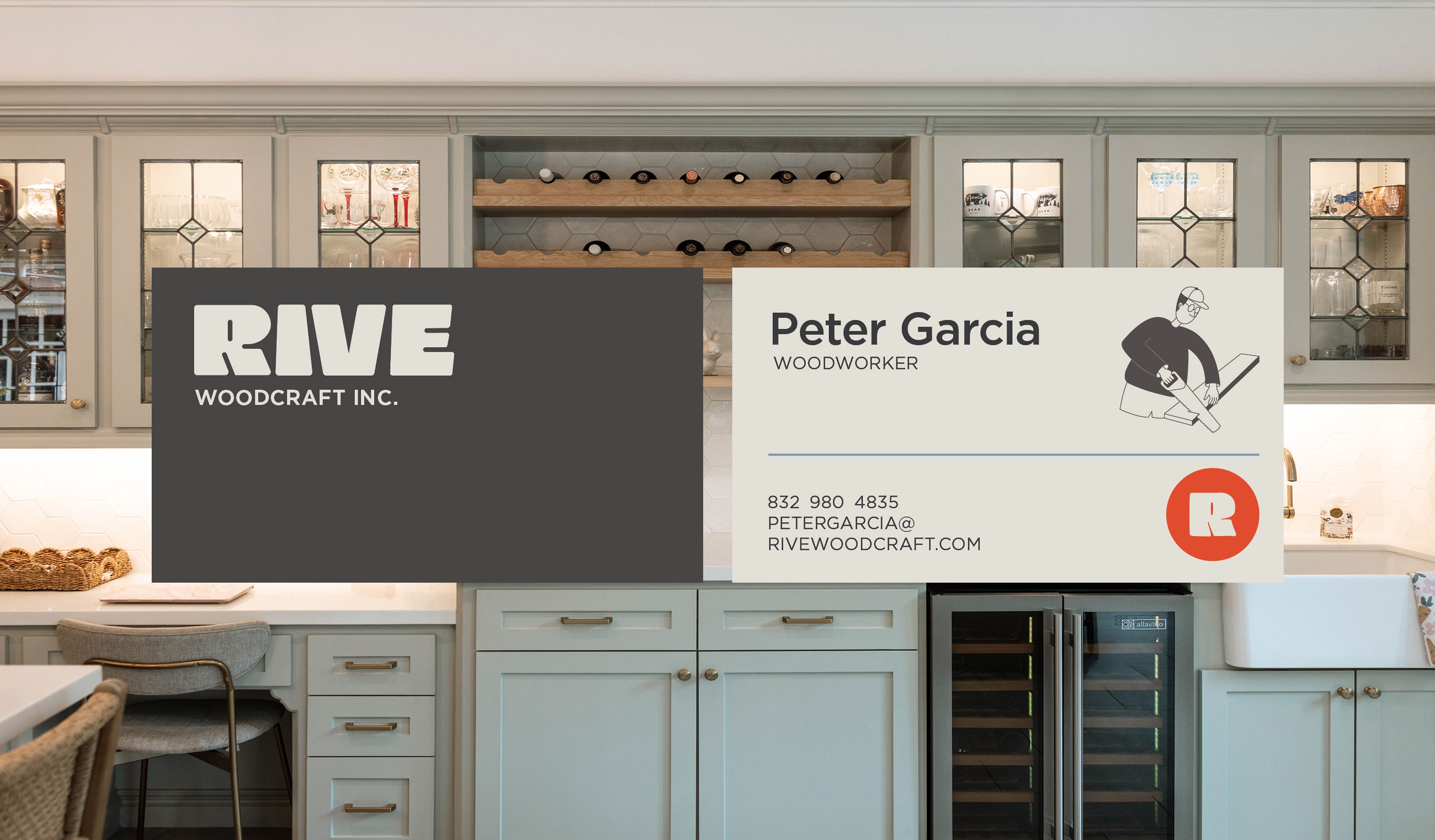
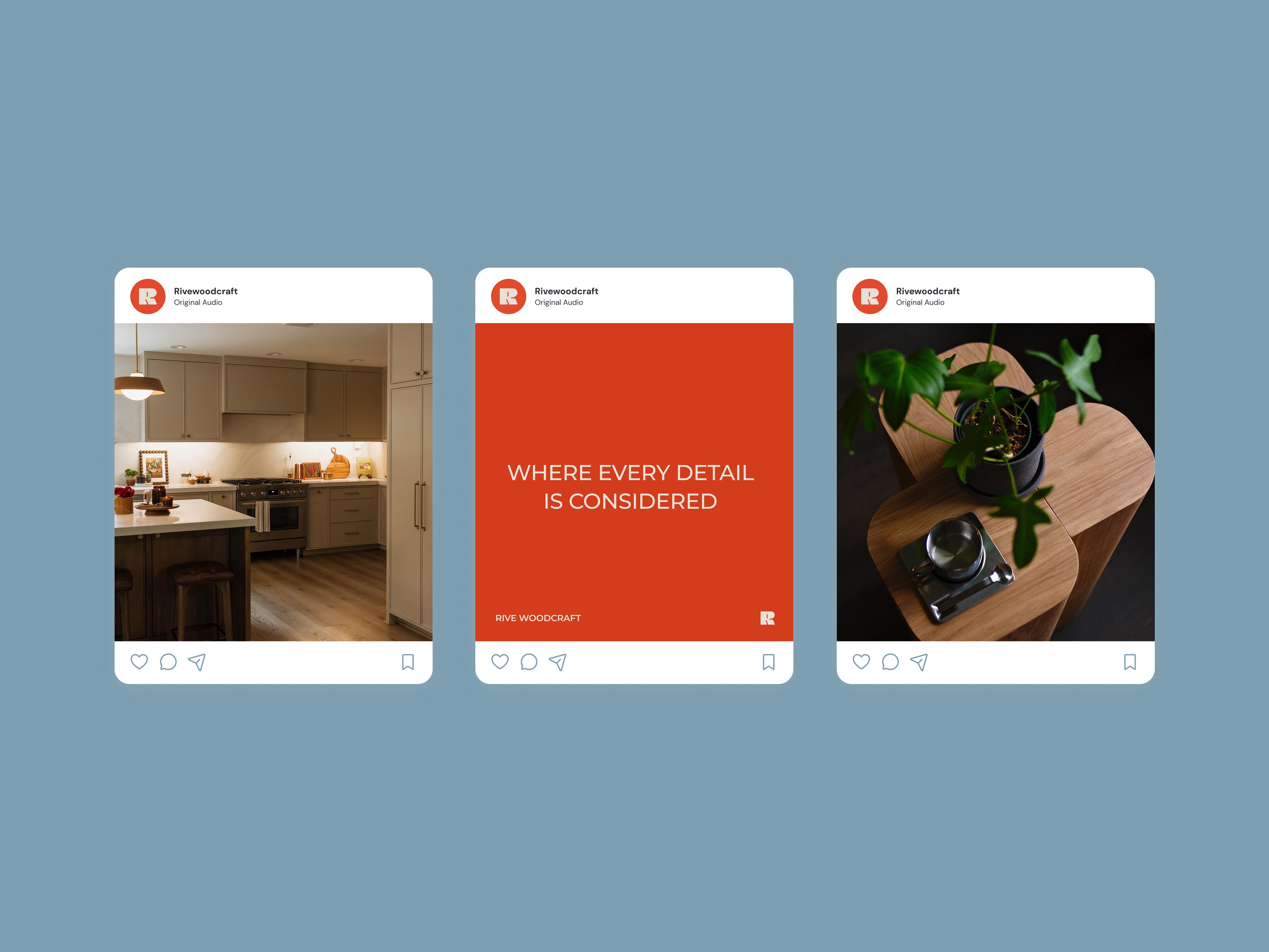
The result was a cohesive identity where quality and craftsmanship came through at every touchpoint, giving Rive Woodcraft a brand that could scale with them as they transitioned into this new audience.

The result was a cohesive identity where quality and craftsmanship came through at every touchpoint, giving Rive Woodcraft a brand that could scale with them as they transitioned into this new audience.