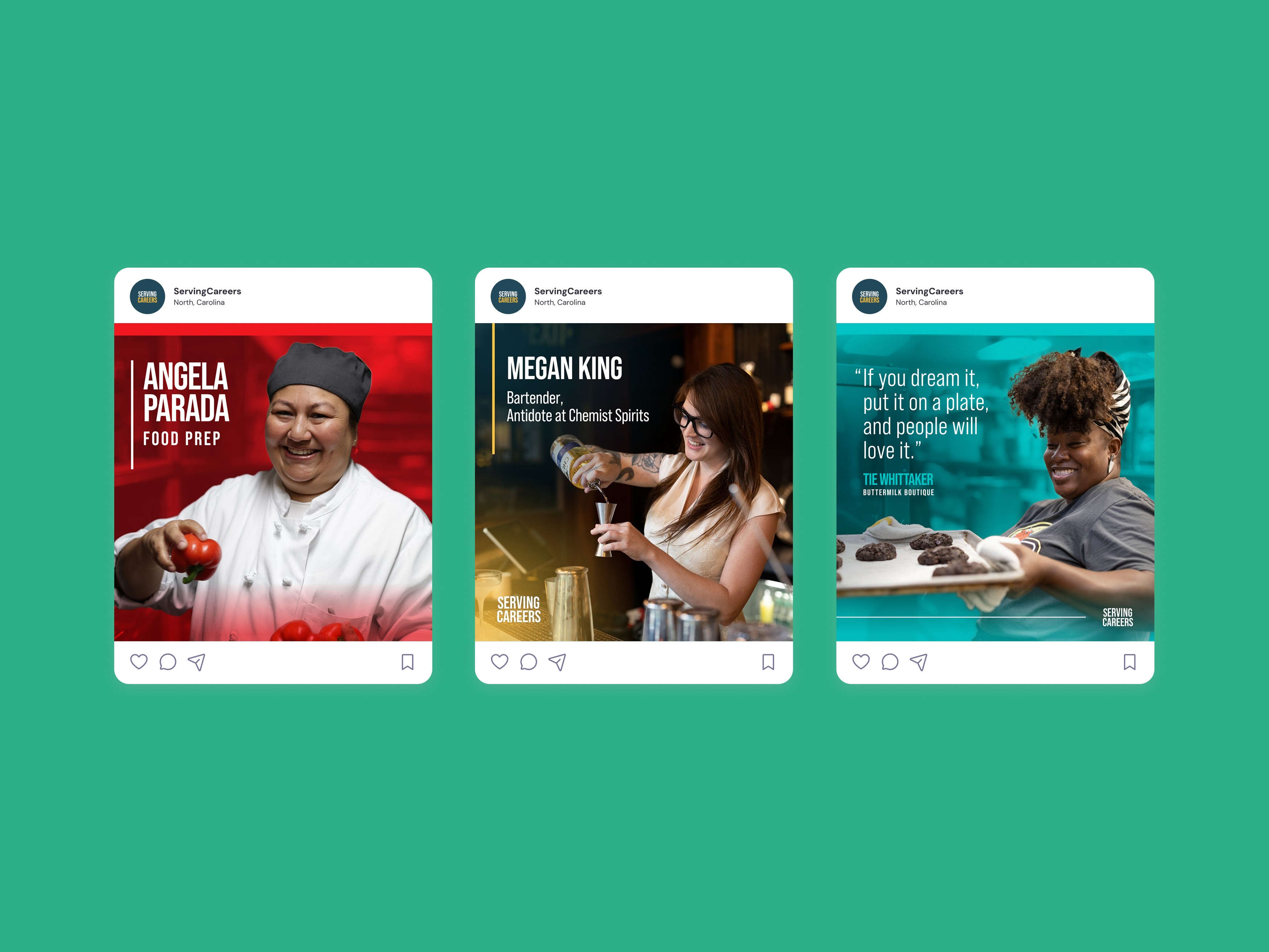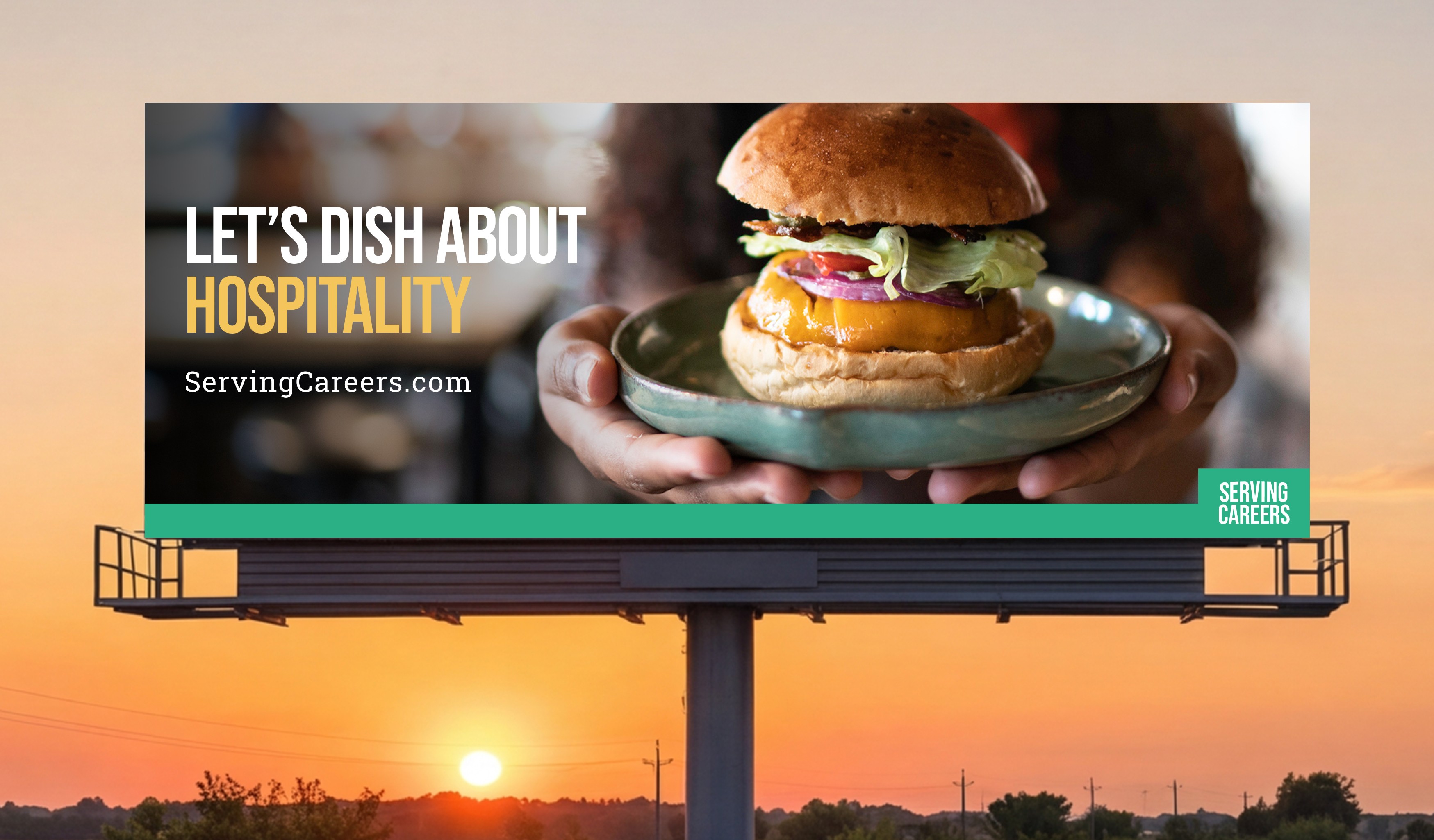
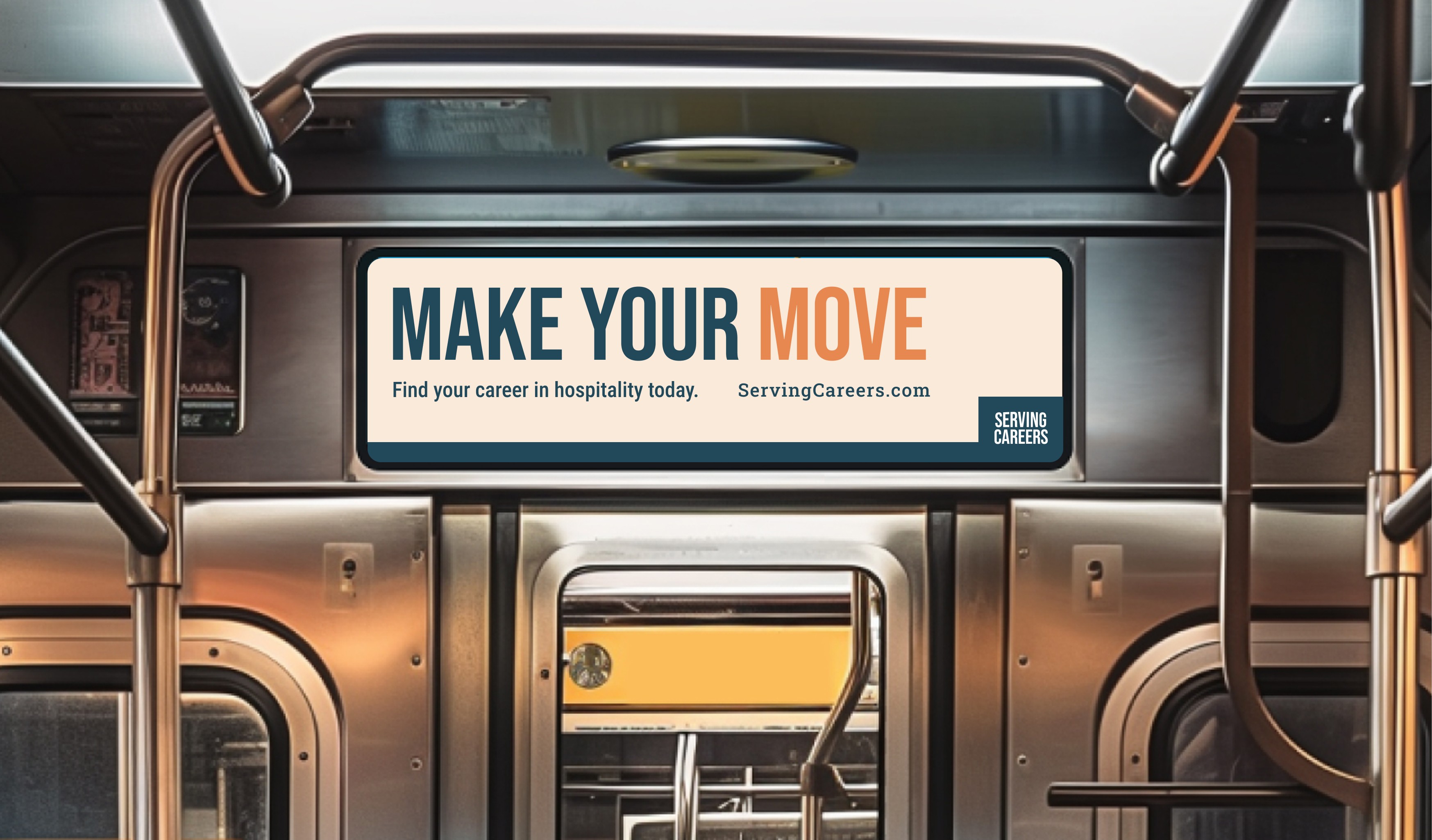
Serving Careers

BRANDING · CAMPAIGN · PRODUCTION · DESIGN SYSTEMS · PRINT

Art Direction / Brand Identity / Visual Direction

THE CHALLANGE:

For a school project, I was tasked with developing an original typeface inspired by a historical invention. I chose the radio and built a system around its silhouette to shape the letterforms, structured forms with curves nodding to the classic radio shape.
I began by exploring a consistent visual system for the alphabet, then developed it further in RoboFont, working through a full 24-character set along with grammatical symbols and ligatures.

Large Project Gallery Image #1

THE SOLUTION:

To properly test and refine the typeface, I needed to see it in real use rather than just on a screen. I designed and hand-stitched a Japanese-bound type specimen zine, showcasing the font in application and demonstrating how it was intended to be used

The zine became part of the design process itself by refining leading, kerning, and letter spacing through iteration, and ultimately serving as the final, printed home for the typeface.

Large Project Gallery Image #1